
In my last post I wrote about how I recently conquered my greatest literary white whale, Frank Herbert’s God Emperor of Dune, after trying and failing several times as a teenager. And in that post, I mentioned how I was drawn to the Dune books by their distinctive covers. I can vividly recall browsing the massive science fiction section of the now-defunct Borders bookstore on Queen’s Street in Bristol and wondering where to start. These books immediately stood out. There have been quite a few different approaches to illustrating the Dune series down the years, and I find each approach fascinating. How do you illustrate this bizarre, far-future universe that’s so thoroughly unlike anything else in its genre? It’s not like high fantasy books that draw aesthetically from medieval western Europe, or near-future sci-fi where you can project current trends forward as an aesthetic reference. Nor is it like the space opera or post-apocalyptic subgenres that each maintain an established aesthetic consistency. The Dune books are difficult to visualize and leave a lot to the imagination. Frank Herbert was a lot more concerned with conceptual details than physical ones, and so a lot of the world-building takes place on this macro-level, going in-depth into abstract topics like history, politics, ecology, religion, culture, and societal institutions, and leaving only sparse references to micro-details like what someone’s wearing, what a building looks like, and so on.
I’ve always imagined that cover designers don’t just come up with an illustration they think will sell, but one that sums up the book in some way. An image that encapsulates the heart of what it’s about. I imagine them challenging themselves to tell the story in a single image. When I was visiting Borders as a teenager, the editions they had on the shelves at the time were the Gollancz trade paperbacks illustrated by Gerry Grace, which emphasized the Dune universe’s strange otherworldliness (see below). They stood in contrast to several early illustrations for Dune that opted for a more understated style in order to emphasize the novel’s literary credentials (something hitherto unorthodox for science fiction books at the time). The Gerry Grace cover that struck me most—and which may have been the one that first caught my eye that day in Borders—was the one for Children of Dune, which depicts a sandworm with some Fremen standing next to it. To me the illustration was telling a story of man vs. nature by juxtaposing the relative smallness of humanity against the immensity of the sandworms. The sandworms seemed to represent the uncontrollable, destructive power of nature, a power that had to be respected at our peril.

The covers for God of Emperor of Dune echo this theme in some ways, albeit with a twist. Both thematically and aesthetically, I feel like there’s a narrative in God Emperor of Dune about bridging the gap between man and nature, with the titular God Emperor Leto II in many ways a synthesis of the two. Throughout the novel there is a recurring discussion about the extent to which he can still be considered human. And at various points he becomes more one than the other. Sometimes he’s Leto Atreides II and he’s emotional, empathetic, and rational—then without warning he will become The Worm, and he’s a wild, primal, destructive animal. The character of Leto II is so fascinating and unique that his presence is almost demanded by the front cover. Down the years there have been some really interesting physical interpretations of him. As I said in my previous post, if you laid out all the books in the Dune saga in front of you, I’m certain that, no matter what edition they were, it would be God Emperor of Dune that catches your eye.
And so today we’re doing something a little different. Today, I want to go through various cover designs for God Emperor of Dune and give you my thoughts on them. I’ll use the classic Tier List rating system, so: S/A/B/C/D/E/F in descending order of quality, with S being the superlative score.
Gollancz, U.K., 2003 – Robert Nicholls
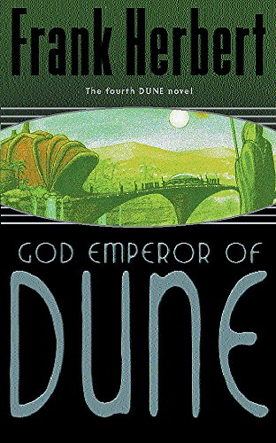
Figured I’d start with the copy I got as a teenager. This would have been the edition I tried and failed to read so many times in my youth. It’s not a bad cover. I do like the image but the image takes up such a small portion of the cover. I get that from a sales perspective you want the names of famous authors or franchises in large font, but from an aesthetic perspective I don’t like it. I prefer books where the image takes up the entirety of the cover. As for the illustration itself, Nicholls goes for a more understated approach, showing the God Emperor’s royal procession crossing a bridge. I don’t see this being the bridge that crosses the Idaho River, but rather being an interpretation of the entrance to the Citadel. I like the architectural style of the bridge and the building, and the waterfalls—while I can’t imagine them being in the Citadel of the book—do look pretty sick. Overall this cover is okay, but unexciting, given the smallness of the image and the generally dull tone.
Rating: C
New English Library, U.K., 1981 – Bruce Pennington
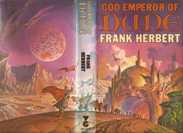
I love this cover. Even though you don’t see the God Emperor himself, you absolutely get a sense of his power. And I think that’s what Pennington was trying to achieve with this illustration. All political and religious power in the galaxy is consolidated in this one entity—that entity being Leto II—and in some ways not showing him puts more of a focus on his power and influence. He’s the axis on which the whole galaxy turns. In this image we see the terrifying fanaticism of the Fish Speakers; the institution on which his power rests. They’re the enforcers of his political will and his religious zeal, and they’re a fascinating, iconic element of the novel. There’s a really interesting passage where the God Emperor actually wonders if he’s created in them a fighting force so fanatical that they could be beyond even his control. On Pennington’s cover here we see them marching into the God Emperor’s Citadel, implying that they are marching to his call, to receive his orders or hear his gospel. Again, I feel like his absence is quite effective for emphasizing the theme of fanaticism, showing the Fish Speakers marching in the direction of his seat of power (the Citadel) rather than showing him personally. You get a chilling sense of the dangers of fanaticism; of religion as an apparatus of political control and military might. I also love how alien the landscape looks—I always like it when Dune covers portray Arrakis in a way that it can’t be confused with real-life desert locations here on Earth. Pennington imbues it with enough otherworldliness to ensure that it still has that unknowable sci-fi quality. The style in which the rocky escarpments, the moon, and the Citadel are rendered gives you the impression of a place that’s utterly unlike one that you’ve read about before. Which it most certainly is—the Arrakis of the God Emperor is a fascinating, strange, and unique setting. I also like the addition of the Forbidden Forest on the right of the cover, which illustrates just how much the God Emperor has changed Arrakis according to his designs (re: the Golden Path).
Rating: A
New English Library, U.S.A., 1990 – Gerry Grace
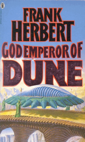
Gerry Grace produced some sick cover art for the Dune series. The images are always interesting, but I wouldn’t say this one was my favorite. Here we see the God Emperor in his cart, as the royal procession crosses the Idaho River. It’s nice to get a close-up of the cart, and I like the scale of the bridge with the epic canyons in the background. The only thing I don’t really like about this cover is the God Emperor himself, who seems a little under-designed, if that’s the right term. You don’t see his face here, which is fine if we imagine that he’s curled up like a cat inside the cart’s retractable dome barrier, but it’s not how I imagine the God Emperor when he’s traveling in procession. It might have been better to do this with the barrier clouded so that you can’t see him. But in this illustration, he looks like a slug with no discernable head. He’s also too small, if we use the human figures beside the cart as a reference. The God Emperor is meant to be big enough that he can easily crush people by rolling into them, which I can’t imagine the one depicted here being able to do.
Rating: B
Caedmon Records, U.S.A., 1982 – Unknown

This is actually the cover of the vinyl for spoken word extracts from the novel, titled “Frank Herbert Reads His God Emperor of Dune (Excerpts)”, released in 1982. I love this faint, grainy art style, I feel like it fits the sandy aesthetic of the series and it reminds me of the cover for the very first edition of Dune published in book form, which was illustrated by the legendary John Schoenherr. The only thing I don’t like about this one is the God Emperor’s head. It looks trapped in the body, and he’s got this pained expression like his existence is physically miserable. He just looks awkward and uncomfortable in his own body, like it doesn’t fit. The God Emperor in the book can move really efficiently, and his body is something he’s gotten used to from millennia of evolution. He’s massive but he can move with terrifying quickness. So I don’t really like the way his head looks stuck, unable to look around. Other than that, I like this one—the scale is just right too.
Rating: B
Volt, Netherlands, 2018 – John Schoenherr
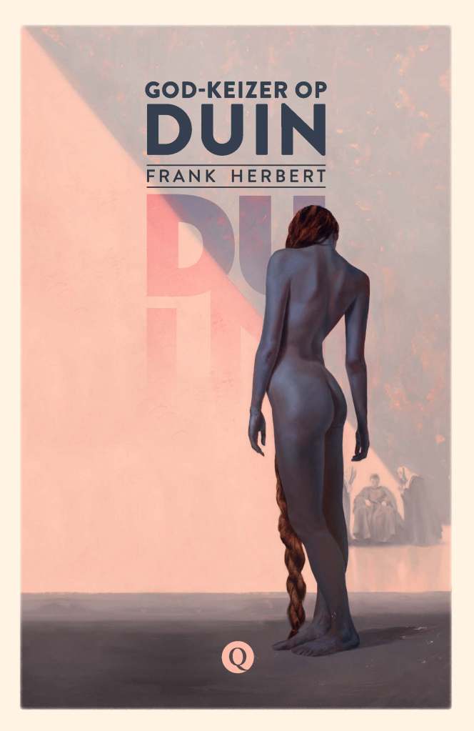
This Dutch cover is interesting just because it’s so different. There’s no God Emperor in sight. Instead, the focus is a naked woman with red hair in a long fishtail braid that reaches all the way down to her feet. She reminds me of Queen Marika from Elden Ring. In the background we see a haughty young man studying her from a chair whilst being attended on other side by two old ladies that are presumably Bene Gesserit. I have no idea what this scene is meant to represent, but I’ve always endorsed the strategy of putting a naked woman sticking her bum out on a front cover when all else fails. There’s no character in the book that I can imagine as the sulky man sitting in the chair. It could be Duncan Idaho—as he is quite sulky in the book actually—and maybe this is him inspecting the Fish Speakers, or one of the Fish Speakers trying to seduce him. Both are plausible scenarios. It could also be that the woman on the cover is Hwi Noree during her last days of conditioning in the Ixian no-chamber, and the bloke in the background is her creepy uncle Malky. I’d probably go with that, since the woman is naked, and Hwi Noree was genetically-engineered since birth to be perfect. If that’s the case, then that’s a fascinating choice for a cover to this novel, and completely unlike all the others. The aesthetic does feel very appropriate for Dune, and to be honest I could picture a scene like this happening. An interesting cover with a nice bum and lots of questions to be asked.
Rating: B
Editura Nemira, Romania, 2003 – Unknown
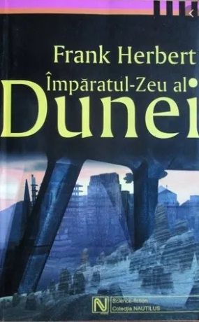
There’s not too much to discuss with this early-2000s Romanian cover as far as details. It’s not a very striking image but I like it because I’ve always been a sucker for futuristic megastructures. I’m assuming that this is meant to be the Citadel, but I could also see it being the festival city of Onn. In general, with book covers I much prefer looking at things rather than people, especially a wide shot of a landscape, city, or structure. So I’m perhaps a little biased towards this sort of approach. As I have noted with other covers, I like the dark tone and muted color scheme. I prefer it when Dune covers give off a cold aesthetic. That said, I can’t justify giving this one a high rating, as the image just doesn’t excite me that much. It’s not very arresting, but I do appreciate it.
Rating: C
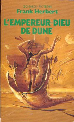
France Loisirs, France, 1984 – Michel Laguens
I like that this French cover has gone for the Fish Speakers for its image as opposed to the God Emperor or the Citadel. It’s different and that makes it interesting. The Fish Speakers as an institution are massively important to the story, and they’re iconic to this book in particular. That said, the image doesn’t really appeal to me, and that’s largely down to my tastes. As I said in the previous entry, I tend not to like book covers with close-up images of people. If I see a sci-fi or fantasy book with the main character(s) on the front, I’m unlikely to buy it. I prefer people to be included as part of a scene, with covers that are more akin to landscape paintings. That’s just my taste though. Also this cover reminds me unsettlingly of David Lynch’s 1984 film adaptation, and just 80s aesthetic trends in general, which I’ve got no time for.
Rating: D
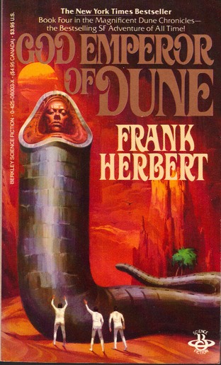
Berkley Books, U.S.A., 1982 – Frederic Marvin
This cover, illustrated by Frederic Marvin, is fascinating and has a lot of talking points. After looking through every God Emperor of Dune cover I can find, I’d say that this one is overall the most accurate in its depiction of Leto II. The scale is just how I imagined it when reading the book, and the illustration does a good job of depicting his ribbed, wormlike body. You can clearly see here how he’s metamorphizing into a sandworm. The way the head sits back in the cowl is also nicely shown. The first thing that strikes me about this cover, whenever I look at it, is how it conveys the loneliness of the God Emperor. This is perhaps the defining aspect of his character, and I feel like Marvin really focused on portraying his sense of isolation when he made this illustration. Leto II had to sacrifice his humanity in order to save the human race from destroying itself, a burden so great that his father, Paul Muad’dib, refused it. The theme of Marvin’s cover is all about the terrible loneliness of the Golden Path, as we see Leto II alone with his thoughts in the Sareer. What’s also very interesting about this cover is that if you look at the spine, there’s an illustration of a woman. This is fascinating to me. Why did Marvin choose to include this? Who is this woman? I don’t think it’s Siona, even though she’s the most important female character in the novel. I imagine Siona as being a little more earthy. After all, she’s a firebrand, a rebel, a fighter. This figure on the book’s spine looks regal, almost angelic. She looks a lot more like Hwi Noree to me—someone I imagine wearing a very elegant dress. After all, she was basically designed to seduce the God Emperor and draw out whatever human part of him might remain. I could also see this woman being Ghanima; even though she doesn’t make an appearance in this novel, she was the person that Leto II loved the most in his life. And given that the front cover sees the God Emperor alone in a desert cave, I can see the woman on the spine being his memory of Ghanima. After all, the woman sort of blends with the sand, and Ghanima has been dead for a good four thousand years, so it could be an attempt by Marvin to heighten the theme of loneliness by depicting him holding on to this distant memory of his sister, lost now to the sands of time. As for the back cover, we see the royal procession making its way across the Idaho River, which could be a reference to the scene when they depart for Onn or the one at the very end of the novel. Overall I love this cover—it’s so interesting and gives us a lot to dissect.
Rating: S
Heyne, Germany, 1982 – H.R. Giger

This German edition of God Emperor of Dune stands out from the rest because the cover has nothing to do with the book. This illustration was made by H.R. Giger in the 1970s after he joined Salvador Dalí to work on the art of Alejandro Jodorowsky’s failed adaptation of the original Dune novel. Jodorowsky asked Giger to be his “architect of evil” and create a castle for the Harkonnens. This castle, like pretty much everything else in Jodorowsky’s crackpot script, does not exist in Frank Herbert’s novel. Jodorowsky’s pretentious vision for butchering the work of an actual genius never made it to the screen (to the immense relief of the known universe), but the paintings that Giger came up with are fascinating nonetheless. Giger tried to imagine the most evil building possible, and conceived of the fortress as being a massive ovoid with just the top protruding above the ground, with most of it below the surface. The fortress would be located on a hill of perpetually-decaying bones and excrement, surrounded by constant storms, and accessible only via a stairway lined with sentient spears at every step. Then at the top it was surrounded by a 70-metre moat with only one drawbridge to access the fortress. The upper portion of the fortress that came above ground could then swivel on a circular track. At the top of the fortress there would be a skull, which could also move and which was outfitted with defensive weapons, as well as a landing pad for aircraft. Inside, the fortress was supposed to be mostly empty and hollow, supported by enormous beams made of bones and inhabited only by these floating, ghastly creatures. It’s all very interesting as a piece of dark surrealism, but it has bugger-all to do with Dune, and even less to do with God Emperor of Dune. So I have mixed feelings. On the one hand, I really like that Giger’s brilliant artwork got to be used for something after the film fell through. On the other, I’d rather the cover have something to do with the book itself. Ultimately, I can’t give this a good rating, but that’s not because it’s a bad illustration. It’s a fascinating blend of gothic and biomechanical art, but it’s just not right as a cover for this book. Maybe the publisher was hoping that the fortress would be interpreted by readers as being the God Emperor’s Citadel?
Rating: D
The infamous Hebrew cover (couldn’t find the publisher details)

In some ways the Hebrew cover has the opposite problem to the above German one, in that it’s contextually appropriate but it’s just a bad illustration. Obviously this is a depiction of the titular God Emperor, but he doesn’t look imposing or impressive at all. The head looks like a bellend with a frowny-face drawn on it, and doesn’t seem to coalesce naturally with the rest of the body. There’s no cowl, and it just looks inconsistent and out of proportion with everything else. It also looks more like a mask than a real face. The arms, while true to the book, also seem like they don’t go naturally with the body, as though the artist had originally drawn the God Emperor without them only to add them on last-minute. They just look awkward, stubby, and ineffectual. And while it’s true that the God Emperor has less need for his limbs as they gradually disappear through the millennia, you should never make him look ineffectual. That’s why I don’t mind some artists dispensing with the limbs altogether, if it makes for a more compelling image. It’s less accurate in a physical sense but more true to the aura and presence of the God Emperor. But the artist here included the arms and they just look awful, especially given how big the head is not so far away. Then you have the perplexing addition of multiple legs lower down the worm-body. In the book, Leto II’s legs have evolved into flippers. But here, we have very clearly human legs—and a good half-dozen of them too for some inexplicable reason. They contribute to this overall impression of the God Emperor as a mutant, with several body-parts from completely different entities crudely stitched together by a mad scientist, rather than him being the product of 4000 years of gradual evolution. I know the God Emperor is quite a challenging subject for an artist, but it’s crucial that he looks natural, that his metamorphosis is happening very slowly across the millennia. I think the metaphorical eye above the God Emperor is a neat idea, and it’s a good way of depicting his prescience. That’s about the only nice thing I have to day about the cover I’m afraid.
Rating: F
Putnam, U.S.A., 1981 – Brad Holland
I would say that after the 1984 cover that Vincent di Fate illustrated for Berkley books, this one by Brad Holland does the next-best job of conveying how imposing the God Emperor is. I think the scale of the God Emperor is probably slightly more accurate here to the book descriptions than di Fate’s version. That said, I think di Fate’s version is more interesting and has a little more personality. What’s interesting about Holland’s cover is that it seems to adapt a specific scene from the novel as faithfully as possible. A lot of the times with book covers, as you will see from many on this list, the image isn’t taken from a specific scene in the book. Rather than being treated as a single frame taken from a line of film, it will be an image that best sums up the book in some way. The aforementioned di Fate illustration, for example, doesn’t seem to be an attempt to adapt any particular scene; one imagines that it took place before the events of the novel. I always saw di Fate’s version as being an introduction to the setting, as if saying “This is the world that Leto II has created in the aftermath of the last book”. With this illustration by Holland for Putnam, I see it as a near-perfect adaptation of the scene where the God Emperor tests Siona in the Sareer, which is arguably the most important scene in the whole book. Of course, if you picked up this copy of God Emperor of Dune for the first time, you probably wouldn’t give the woman in the foreground much thought. She has her back to the viewer because she’s looking at Leto II, which helps serve to guide your eye toward him. So she does function as a stand-in for the human race, and by contrast to the focus of the image, lends the God Emperor an impressive sense of scale. But after reading the book, you realize that this isn’t just a stand-in for the human race that’s serving as a point of reference for the God Emperor—this is actually the scene where Siona is having an intense discussion of ideas with him in the desert. So I appreciate this cover for taking a different approach to many of the others, one based on fidelity to the content rather than metaphor. It’s nice to have variety!
Rating: A
Omnia, Czech Republic, 1996 – Unknown

Make all the Teletubbies jokes you want, I don’t think this is that bad. Okay, it’s not great, but I like the idea. The foreground is realistic and the background is metaphorical. Here we see what can either be interpreted as the Sareer, or perhaps a memory of Arrakis before it was terraformed. And on the horizon, we see the ghostly body of a sandworm with a star superimposed onto the head, in which there is a childlike face. The childlike face kinda makes sense as Leto II started his metamorphosis in his youth. I also feel like it works here because the face has an expression that makes it look wise beyond its years. Interesting concept. With just a static image we get a sense of immense change. In some ways I see this as the God Emperor looking down at Arrakis and thinking about how he’s going to remake it, but it could also be seen as him remembering how it was. Either way, I feel a sense of time passing.
Rating: C
Baronet, Czech Republic, 2022 – Unknown

This modern Czech cover echoes its 90s predecessor in a lot of ways. Once again, we have an impossibly-large version of the God Emperor looking down at the Arrakis landscape, only this time he looks strangely like Michael Fassbender. Rather than the barren desert we got in the 90s cover, the modern Czech cover shows the terraformed landscape of Arrakis, with rocky bluffs juxtaposed with lush jungles. Obviously, the God Emperor here is metaphorical. I see this image as him looking down on the Arrakis he created, with the calm expression of a guardian. His face conveys a sense of wisdom and care, but it’s also stern and static, showing us that there is no tolerance for anything outside the realm of his Golden Path. Overall, I just get an impression of him here as a custodian. As for how he’s depicted, it’s not terrible, but I feel like the human face and the worm body are too much at odds with one another. I would prefer the mouth be less developed, and integrate more naturally with the face. Here it looks like they are each independent entities, as though Michael Fassbender is somehow trapped inside a fully-grown sandworm and popping out the mouth as if to say “Yooo-hooo!”.
Rating: C
Gollancz, U.K., 2021 – Sean Francis O’Connell
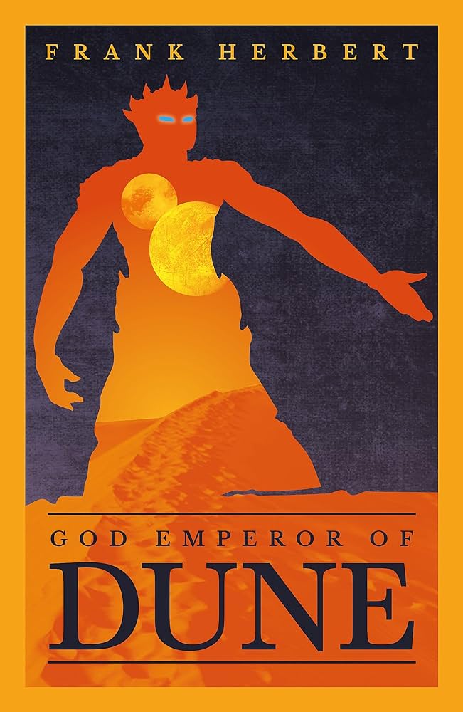
I might be wrong, but I swear there’s a trend of modern covers having a better design quality but old covers having a more interesting illustration. A lot of the new covers that came out in the wake of Denis Villeneuve’s 2021 film adaptation look gorgeous on a shelf, but I feel like the images themselves are quite simplistic. Cover design and cover illustration are two different jobs and more often than not they’re done by two different professionals. I love the design here for the new Gollancz cover. The silhouette of the God Emperor is striking with his blue eyes and imperious pose, and I love the way that the image of Arrakis is contained within him. Inside the silhouette we see the twin moons, an iconic sand dune, and a brilliant dusty-orange haze. I love that Leto II here functions as the prism through which we see Arrakis—it’s a masterful way of conveying the theme that this is his planet now, and he maintains full control of it. It really is excellent design, but the illustration itself doesn’t excite me. I’m biased towards covers that look almost like paintings, even though they are, from a design POV, less complex.
Rating: B
Ace Books, U.S.A., 2019 – Jim Tierney
This is the cover you’re most likely to encounter today in your local B&N. I have to admit, I quite like it. It’s not a very striking cover, but it’s pleasing on the eye and looks great when it stands alongside the rest of the books in its set. Instead of depicting the titular God Emperor himself, the illustration shows the scene from the novel’s iconic opening chapter. We see the Forbidden Forest, the red eyes of the God Emperor’s D-Wolves staring out of the trees, the Idaho River, and the Citadel. It’s interesting that they went for this, as the Forbidden Forest and the D-Wolves don’t make another appearance beyond that first chapter. But like I said, I do get the impression it’s quite an iconic scene, and one that no doubt sticks in the memory of many readers. Overall I do like this cover, especially the vertical title and the way the book looks when presented alongside the rest in the series published by Ace Books, but purely as an image it just doesn’t excite me very much.
Rating: C
Presses Pocket, France, 1986 – Wojtek Siudmak
This 80s French cover goes for a more metaphorical portrayal of the God Emperor rather than a literal one—which isn’t something I mind. Here we don’t see Leto II as he exists in the book, but an abstract representation of the way he’s both a human and a sandworm, yet wholly neither. The naked man reminds me a little bit of Leonardo da Vinci’s Vitruvian Man, and I see it not so much as being Leto Atreides II but a kind of all-encompassing representation of the human race. To me it doesn’t depict the character of Leto II, but the concept of metamorphosis. This image depicts the perilous, unprecedented journey that he has had to make in giving up his humanity to become The Worm. It’s Man becoming Nature, and even before I read God Emperor of Dune, I always found this cover to be quite foreboding. I love the sandy color scheme, but overall I wouldn’t say this is a cover that I find especially striking. There’s a lot to like, but I don’t enjoy it as much as some of the other illustrations.
Rating: B
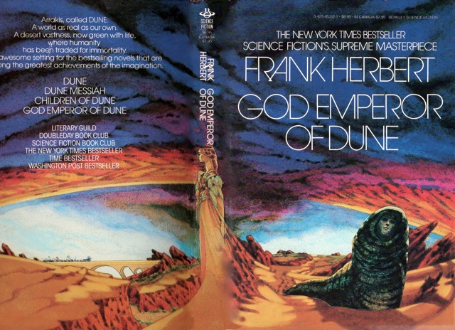
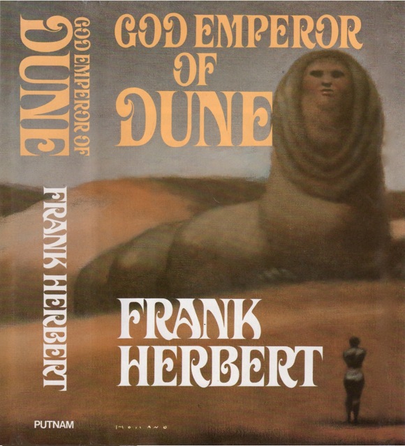
Berkley Books, U.S.A., 1984 – Vincent di Fate
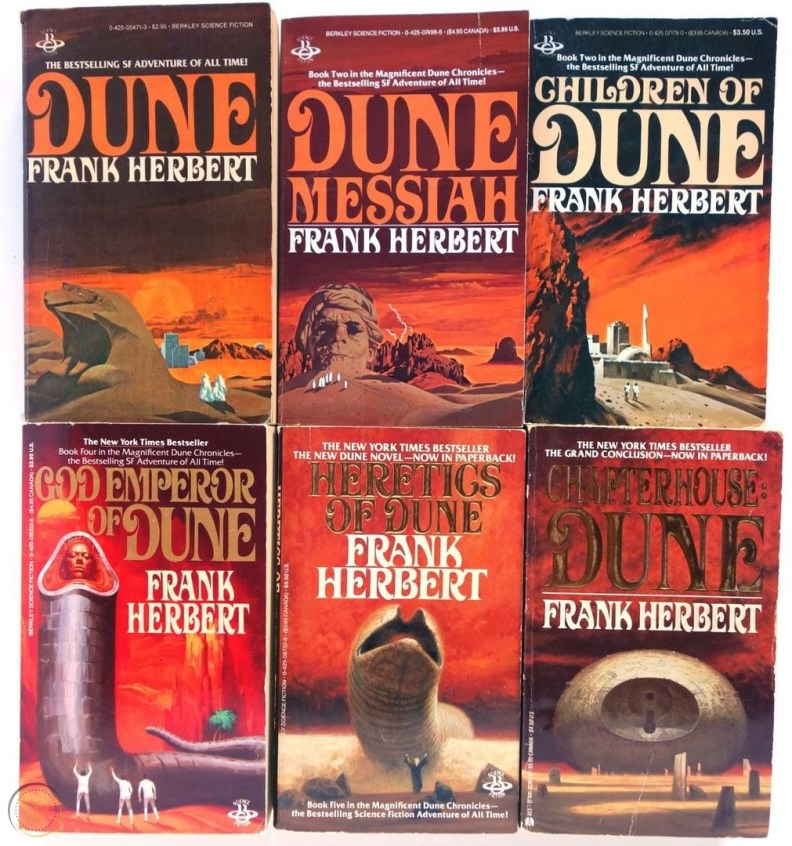
This was the cover that always struck me the most. When I decided to have another go at the book last year, this was the edition I bought. It was the one I’d always wanted and finally getting my hands on it gave me that extra motivation to finish it after failing so many times as a teenager. In terms of its interpretation of the God Emperor, I feel like it diverges from the descriptions in the book—with exception to the face. In the book, his face is described as being in a cowl that functions not unlike an eyelid, which he uses now and then to protect his exposed head. I feel like this edition captures the description of his head sitting in this cowl quite well. Other than that, however, there are a few liberties. For example, in the novel, he’s described as still having arms and hands. His legs have evolved into little flippers, which will one day disappear too. Neither the arms nor the flippers are depicted in the Vincent di Fate illustration, but I can’t deny that the God Emperor looks better this way than he would if the limbs were included. Di Fate seems to have rendered him much further along in his gradual evolution into a sandworm; Leto II looks here like a more-or-less fully-grown sandworm but with just the head remaining from his human body. To me it looks like how the God Emperor would have looked another thousand or so years after the events of the novel. But I think this artistic license is also why I like the cover so much; of all the illustrations, this one makes the God Emperor look the most imposing. The people you see around him are tiny in comparison. It really emphasizes the man-versus-nature theme that’s always characterized Dune illustrations. While it doesn’t render the God Emperor accurately in a physical sense, it does capture the immensity of his presence, mind, personality, and power in contrast to those around him. So I think of it as a visual representation of his dynamic with the world around him. I think of all the covers on this list, this one is absolutely the most striking. It does everything a good cover should do, which is draw your attention and ignite your imagination. I should add to that that the Berkley editions of the Dune series illustrated by Vincent di Fate and John Schoenherr (see below) are my favorite editions of all. I love the moody, reddish skies that feature in all the covers of this set—the color scheme just sets the perfect tone for the series. It’s menacing and mysterious in equal measure. Aside from the God Emperor of Dune cover in this set, I’m also obsessed with these editions of Children of Dune and Chapterhouse Dune. I’d like to collect them all one day.
Rating: S

The one with the slave girl is actually from the folio society edition of dune and the art is by sam weber. no idea why it’s a god emperor cover. it depicts this passage: Here was a new slaveconcubine, then, red-haired like my father, willowy and graceful. She had a
dancer’s muscles, and her training obviously had included neuro-enticement. My
father looked at her for a long time as she postured unclothed before him.
Finally he said: “She is too beautiful. We will save her as a gift. ” You have
no idea how much consternation this restraint created in the Royal Creche.
Subtlety and self-control were, after all, the most deadly threats to us all.
-“In My Father’s House” by the Princess Irulan
You seem to have put the schoenherr one on that illustration instead of the vinyl cover. Fantastic article though!
LikeLiked by 1 person
Thank you for sharing that – that’s absolutely fascinating that they went with such a brief/seemingly insignificant scene for the cover. It really interests me how these decisions are made and what passages stand out to certain artists. I’ll look do some research into Sam Weber 🙂
LikeLike